
Value Stream & Process Mapping
Visualizing Work Processes
Why Draw Pictures?
A factory is enormously complex. Only visuals convey enough information to understand the pieces, relationships, hidden waste and time-domain behavior. Visualization brings a deep understanding and major breakthroughs in productivity and other performance. It leads to consensus on systemic problems and remedies. While finished charts communicate information about a situation, the real value is the mapping itself. This is where insights grow, paradigms shift and consensus builds.
Value Stream Maps
What Is A Value Stream?
A Value Stream is “the set of all the specific actions required to bring a specific product through the three critical management tasks of any business: …problem solving, …information management, …physical transformation”. --Womack & Jones
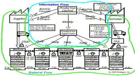
Value Stream Mapping (VSM) is a visualization tool oriented to the Toyota version of Lean Manufacturing (Toyota Production System). It helps to understand and streamline work processes using the tools and techniques of Lean Manufacturing.
VSM addresses material process sequences and flows as well as information flows that impact this movement. It encourages data acquisition in a systematic manner that often gives additional insights. The various icons and symbols have fairly specific meanings and it requires knowledge of these symbols as well as knowledge of TPS to interpret a Value Stream Map and use it well.
Value Stream Maps reflect a broad view of the process, usually from external supplier to external customer at a given facility. Extended Value Stream Maps take an even broader view and often incorporate tier two and tier three suppliers and distributors.
Like Process Mapping, VSM is most valuable in a group setting. Many of the problems it exposes reach across organizational lines of responsibility and expertise. When a mapping team has representation from all the different functions and specialties, it gains a common understanding of the process and a better position for developing and implementing good solutions.
When To Use Value Stream Maps
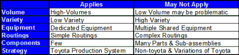
No mapping technique fits every situation and purpose. Use Value Stream Mapping for high-production, low-variety product mixes with few components and subassemblies and dedicated equipment. In other situations, Process Mapping, often combined with a Group Technology analysis may be a better choice.
Where To Use VSM
Value Stream Mapping works best with dedicated processes and low variety as often found in automotive and consumer product operations.
Process Maps (charts)
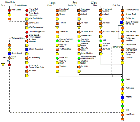
These are also known as "Process Charts" or "flow Process Charts". They trace the sequence of events for a single product. While they can be done at any level, the most useful charts are quite detailed. This is important because most waste is at a micro- level.
Frank Gilbreth's symbology, which we prefer, is simple and visual. One does not need the Rosetta Stone to decipher hieroglyphics. It dramatically displays waste. In this example, all but the green circles are waste.
Process mapping is a great tool for Kaizen events. Their simplicity makes them ideal when training time is limited.
Which To Use?
The short answer is both. Value Stream and Process Maps take different perspectives, but, the work they visualize is the same. Both have a place
- Value Streams to identify opportunities
- Process charts to identify specific wastes and improvements
■ ■ ■ ■ ■ ■ ■
|
The Strategos Guide To Value Stream and Process Mapping goes beyond symbols and arrows. In over 163 pages it tells the reader how to do it and what to do with it. |
The free newsletter of Lean strategy